The Need
The USAID brand guidelines clearly state that individual programs cannot have their own branding. And it makes sense. If the hundreds of programs at USAID developed their own brands, it would be a mess. However, I still wanted to find a way for localworks to have a distinct brand that was approachable and friendly to the people we served. While renaming our program to avoid becoming another acronym was one way of doing that, as outlined in this project, another way to develop a friendly brand was through verbal and visual brand communication.
Visual Brand Communication
The primary font family for USAID is Gill Sans. When I first joined the agency I was disappointed that this was the font I had to work with. Historically, it is a distinctly British font that has been used to represent a post-war British identity. I thought it was a timeless font but not the most appropriate choice for a U.S. federal agency. It somehow seemed off. This is why at first, I had actually ignored the brand guidelines to use a font I thought was more appropriate—Transport. Incidentally, it was also a British font, designed for public road signs in the U.K. It was highly visible from afar and had a friendly, approachable look. I thought it was the perfect "public" font.
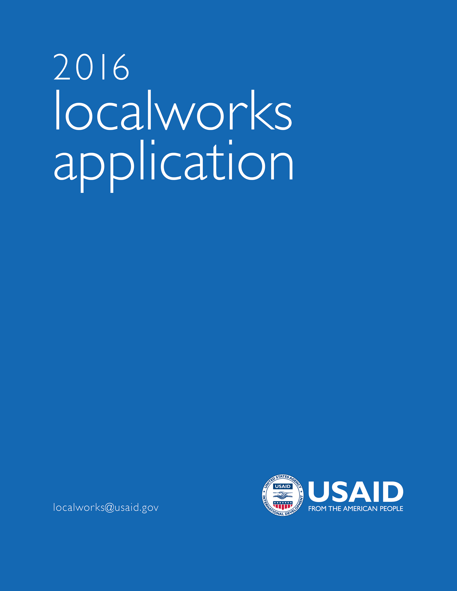
For the first year of the localworks program, in 2015, I began using Transport and Lato (for body text) as our primary fonts. I created a logotype for localworks using Transport Medium, and went against the rule that USAID programs could not have its own logo. I also used a bright royal blue, another violation of the USAID brand guidelines.
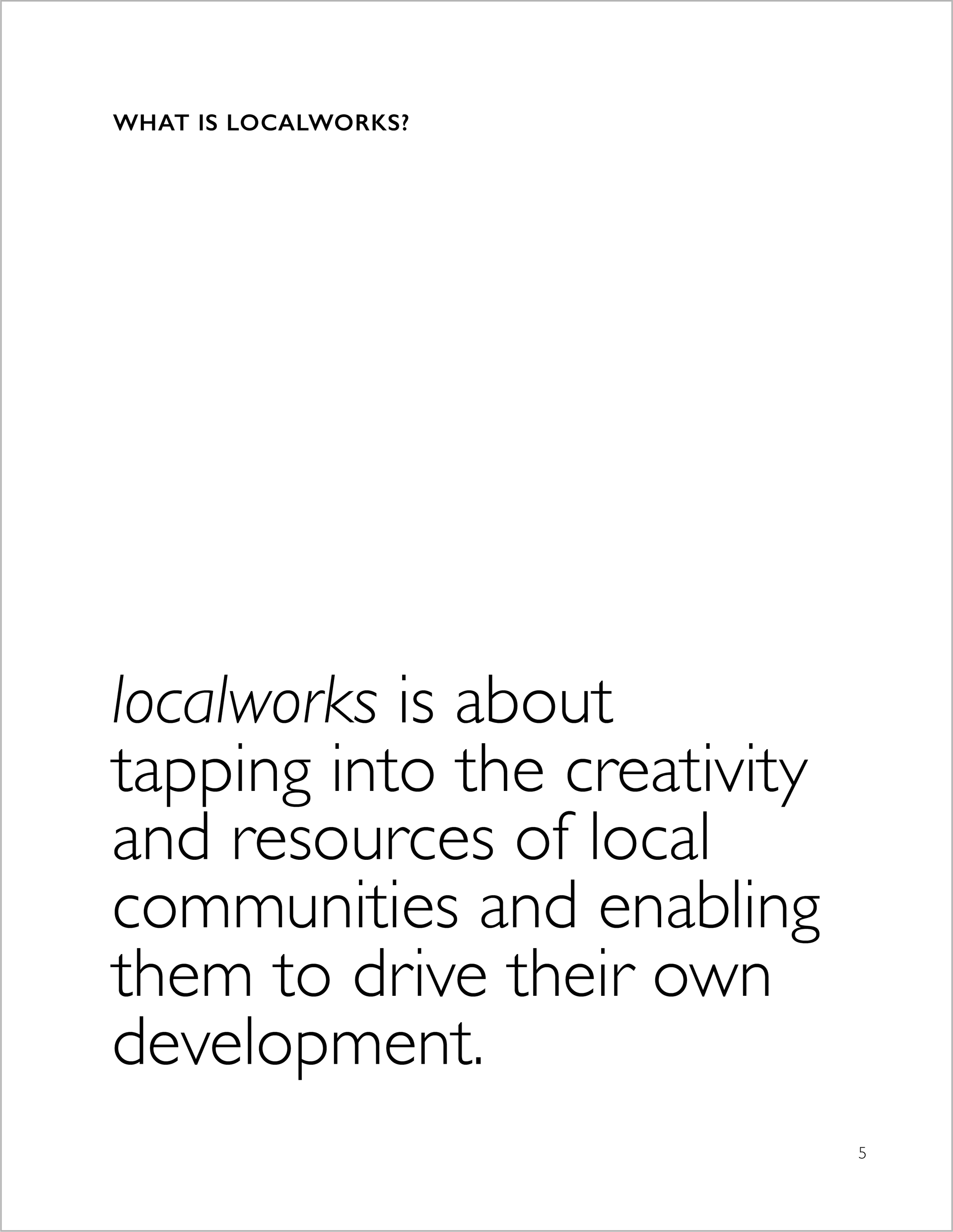
Examples of the various collateral designed with the 2015 localworks branding, breaking all kinds of rules.
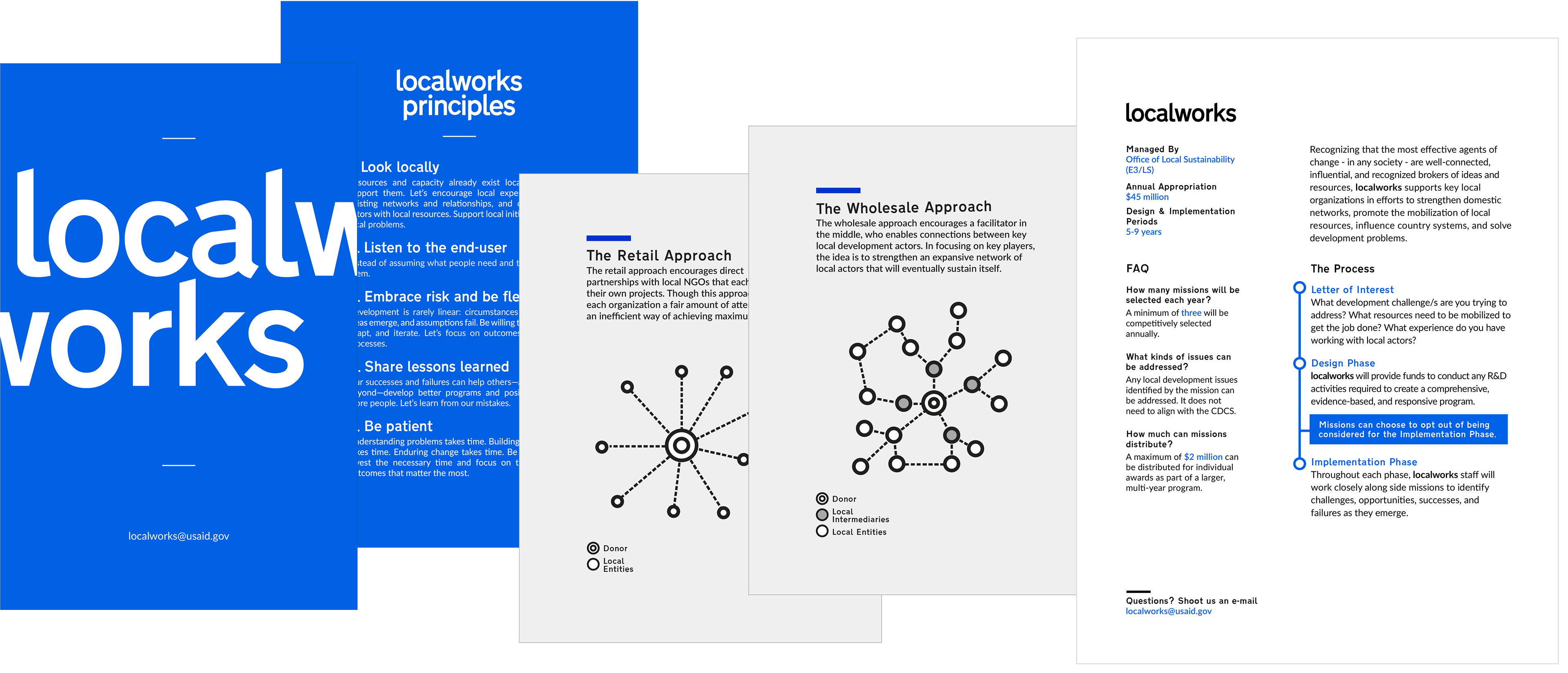
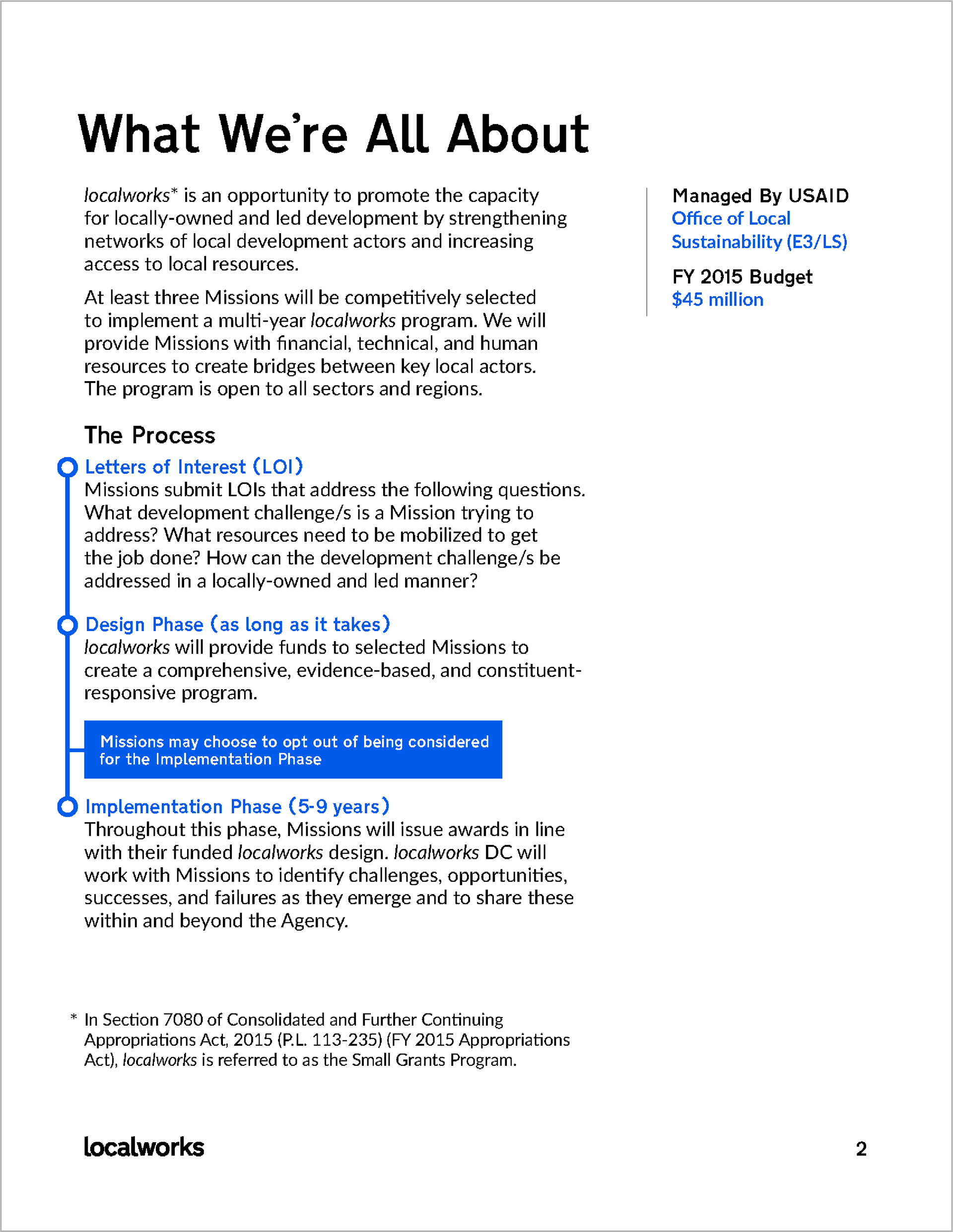
As you can see below, the 2015 program document (left) looks nothing like a USAID document compared with the 2016 program document. There is no indication that it's even associated with USAID, and there's also a "localworks" logotype that is shamelessly taking center stage. The bright royal blue color is also nowhere near an approved USAID color.
Below is one of the pages from the program document. On the left is a page from 2015, introducing the program under the header "What We're All About". From even just the header, you can tell how informal of a tone we took. It's a stark contrast from the 2016 document, on the right, which is a bit more reserved in terms of tone, but without losing its human and straight forward voice.
After a year of using the "rebellious" localworks branding that broke all the rules, I realized I had to make a change. Politically, any new initiative like localworks is not always welcome. There is a sense that new initiatives are arrogant, claiming to know all the answers to doing development the right way, as if the agency hasn't been doing anything of substance for the last 50+ years. The much too extreme branding I had set forth for localworks was contributing to the perception that we were a know-it-all new initiative.
Additionally, it wasn't fair for me to do whatever the hell I wanted with the branding—that would be too easy. The real challenge for me would be to create a distinct localworks identity that was within the USAID branding constraints. I would use Gill Sans, even if I didn't like it; I would use the red, white, and blue color scheme, even if it was limiting.
So that's what I did. I developed a new visual identity for localworks that was clean, straight-forward, and flexible—all the while still remaining within the USAID brand guidelines.
The New localworks Brand
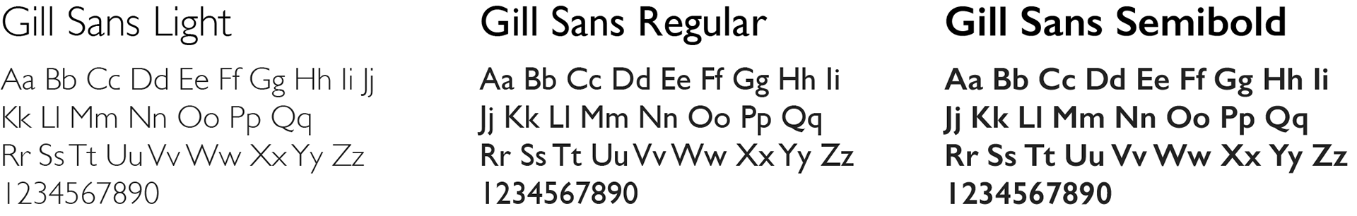
For localworks, I opted to use Gill Sans Light for a more modern look, with secondary typefaces like Gill Sans Regular and Gill Sans Semibold for headers and subheads.
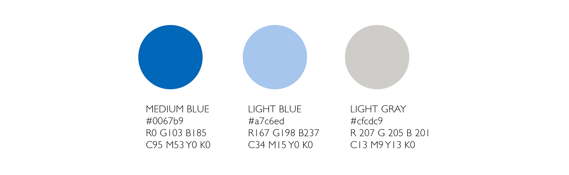
I chose USAID's Medium Blue as the primary color for localworks. Though there was a prevalence of USAID Red in much of the agency's collateral, Medium Blue was not as widespread. Another potential option could have been USAID Blue, but as a very common navy blue color, it was not the best fit for representing a unique and new initiative like localworks.
Non-logo
Since individual USAID programs were not allowed to be branded, localworks could not have a logo of its own. To work around this restriction, we made the "l" in "localworks" lowercase during the program's naming process. It was also a strategic decision to make the brand more friendly and approachable. As USAID's brand image was strong and bold, donning an all-caps logomark, I wanted to soften the image of localworks by dropping the capitalization. Though it was a seemingly insignificant design decision, it is what established localworks' unique identity. The only caveat was that wherever the name appeared, the USAID logo had to follow.
Since individual USAID programs were not allowed to be branded, localworks could not have a logo of its own. To work around this restriction, we made the "l" in "localworks" lowercase during the program's naming process. It was also a strategic decision to make the brand more friendly and approachable. As USAID's brand image was strong and bold, donning an all-caps logomark, I wanted to soften the image of localworks by dropping the capitalization. Though it was a seemingly insignificant design decision, it is what established localworks' unique identity. The only caveat was that wherever the name appeared, the USAID logo had to follow.
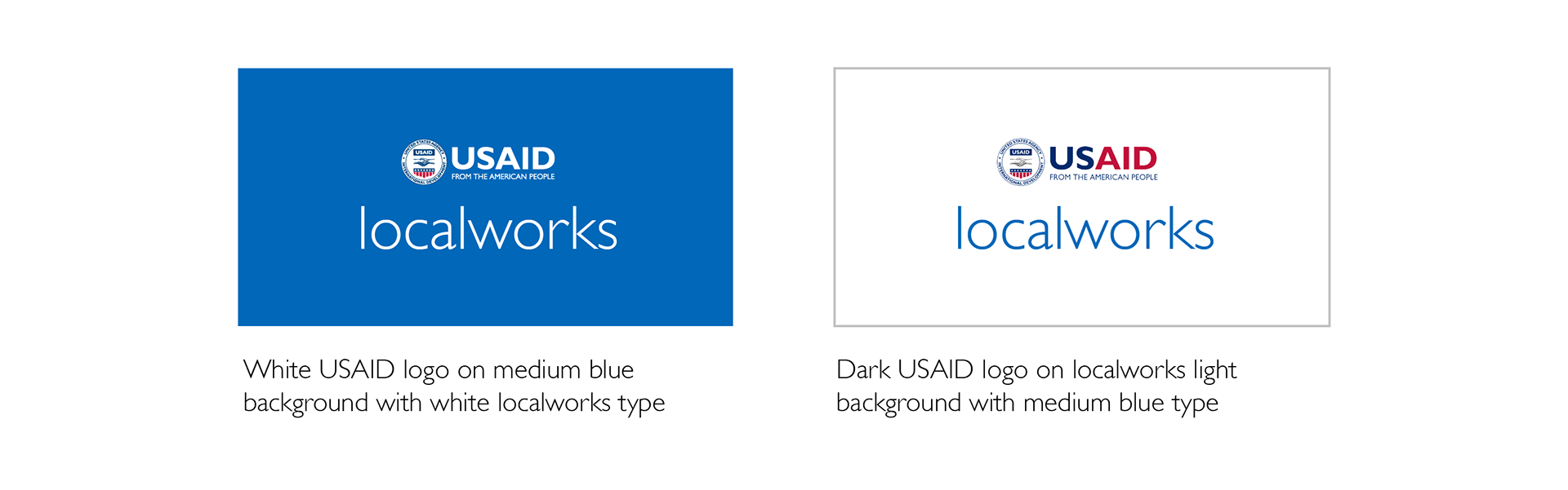
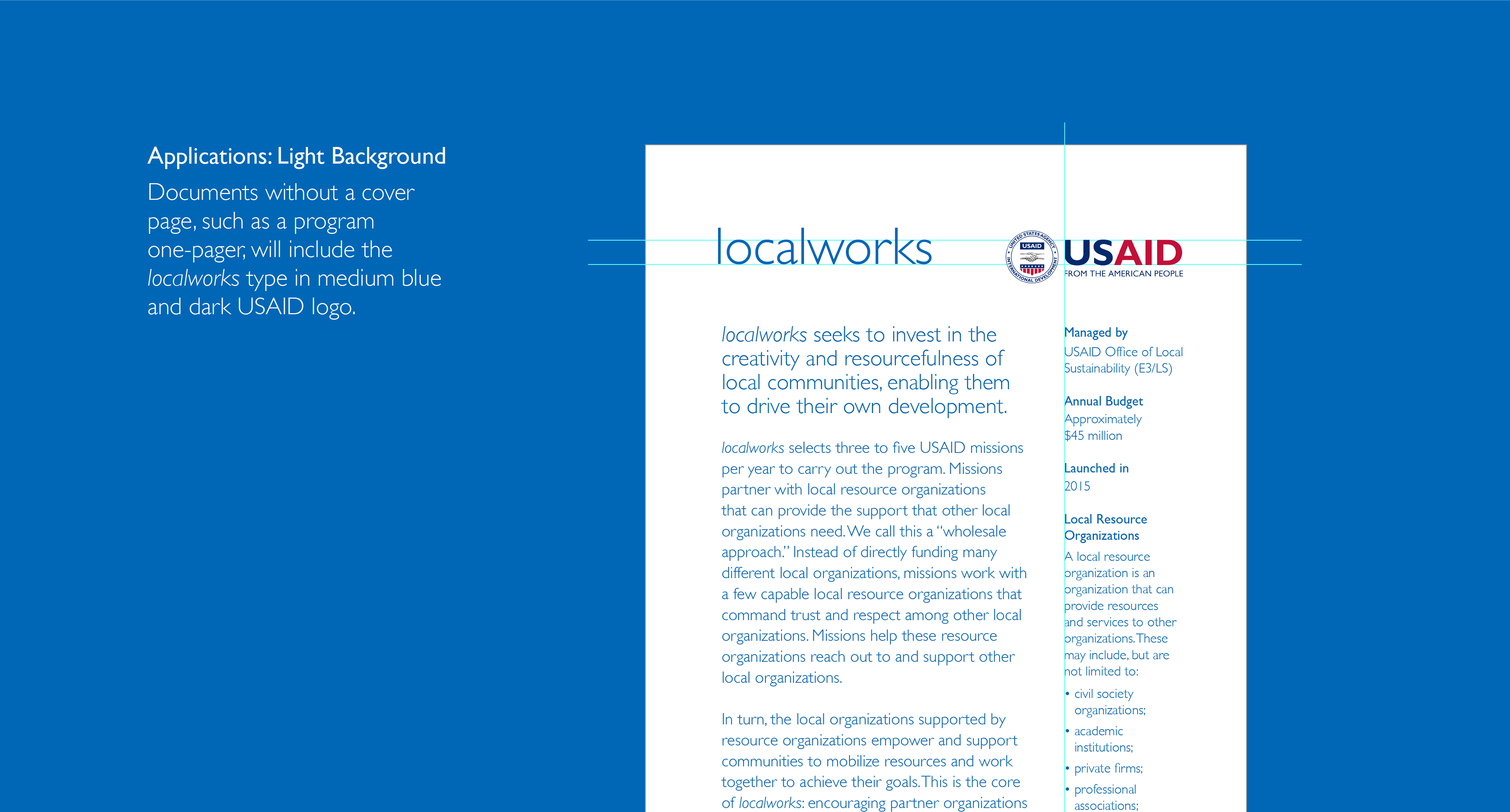
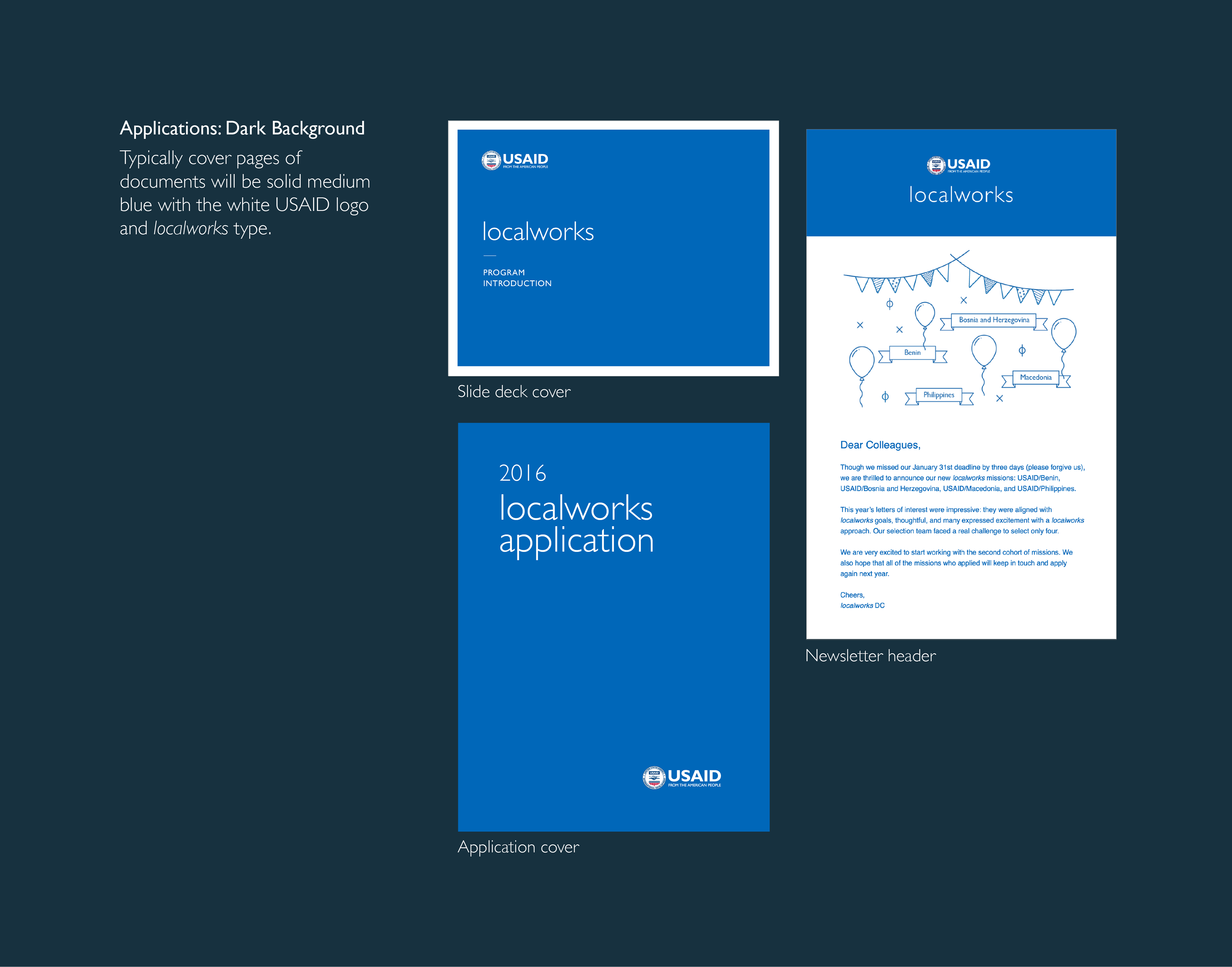
Depending on the application, the localworks type and USAID logo are arranged in different colors against different backgrounds.
Verbal Brand Communication
Plain Writing
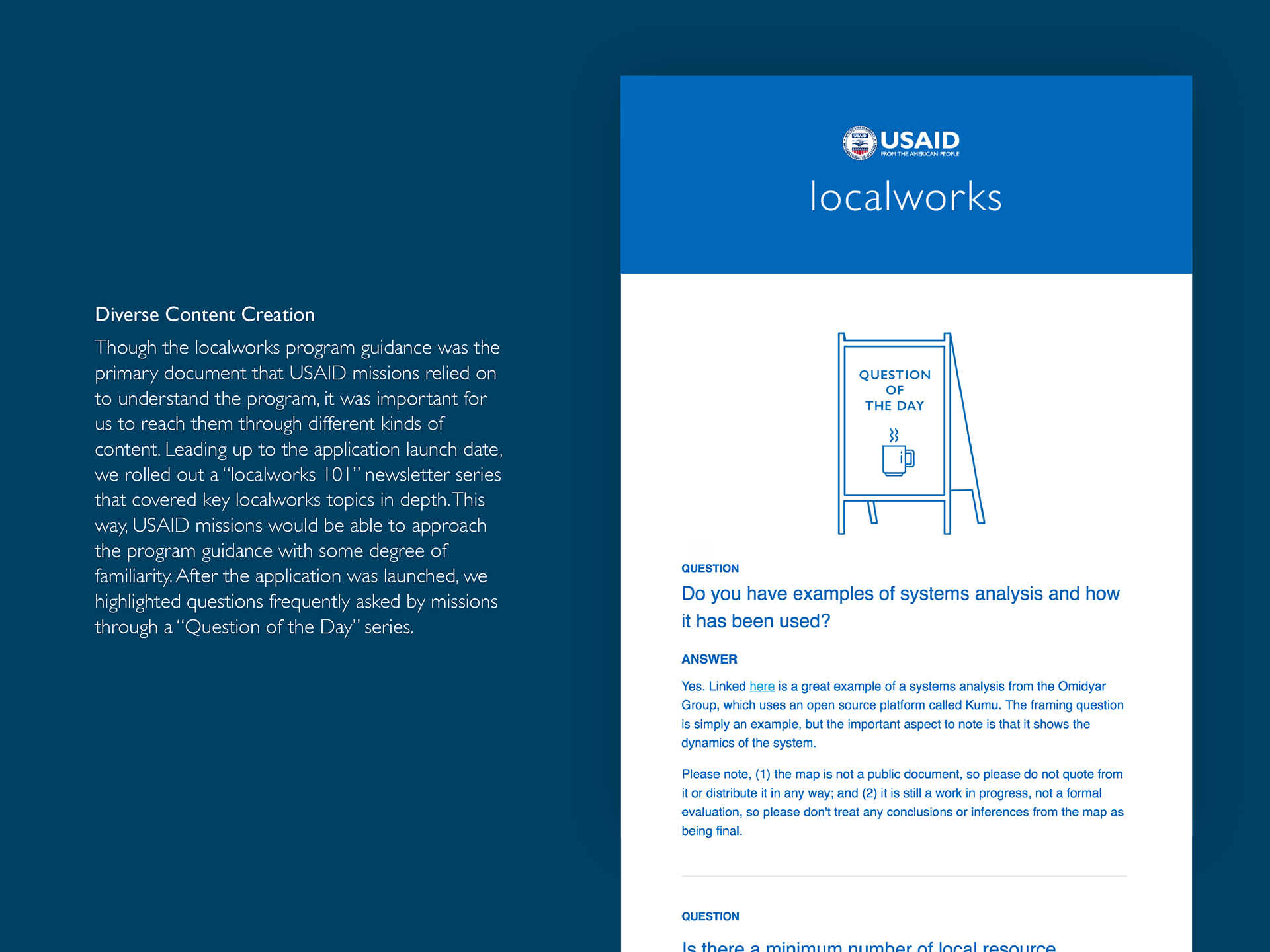
To develop a strong verbal identity that spoke to a friendly and approachable brand, writing in plain language was a must. There weren’t any official USAID rules about verbal identity, so I decided to make sure localworks’ brand was communicated through every word people read. Though plain language was legislatively mandated for all federal agencies via the Plain Writing Act of 2010, much of the writing at USAID was anything but plain. It was easy to find run-on sentences peppered with development jargon, making the writing dry and unpleasant to read.
To develop a strong verbal identity that spoke to a friendly and approachable brand, writing in plain language was a must. There weren’t any official USAID rules about verbal identity, so I decided to make sure localworks’ brand was communicated through every word people read. Though plain language was legislatively mandated for all federal agencies via the Plain Writing Act of 2010, much of the writing at USAID was anything but plain. It was easy to find run-on sentences peppered with development jargon, making the writing dry and unpleasant to read.
USAID missions* were usually swamped with all kinds of program documents from different portfolios, so making sure localworks material was approachable, easy to understand, and easy to digest was essential. Most importantly, if we were about being accessible to communities in developing countries, we had to restrain ourselves from using unnecessary acronyms and esoteric jargon.
*mission — aka USAID field offices located within the countries we serve.
*mission — aka USAID field offices located within the countries we serve.
Voice & Tone
In addition to writing in plain language, developing a distinct voice for the localworks “brand” was crucial in keeping our audience engaged. It was instrumental in keeping our writing style consistent across platforms—whether it be newsletters, program guidances, welcome books, and animation videos.
In addition to writing in plain language, developing a distinct voice for the localworks “brand” was crucial in keeping our audience engaged. It was instrumental in keeping our writing style consistent across platforms—whether it be newsletters, program guidances, welcome books, and animation videos.
Having a Personality
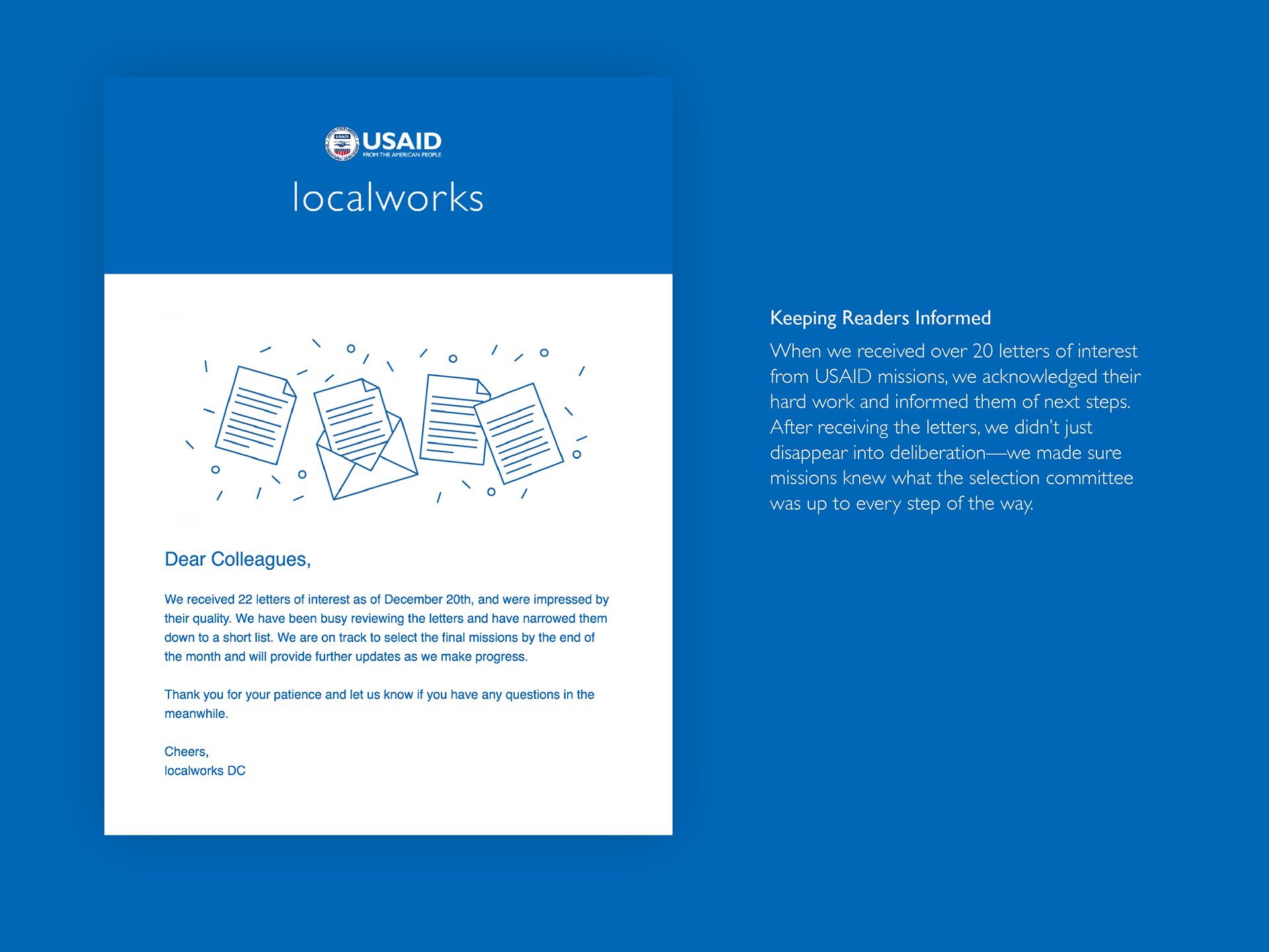
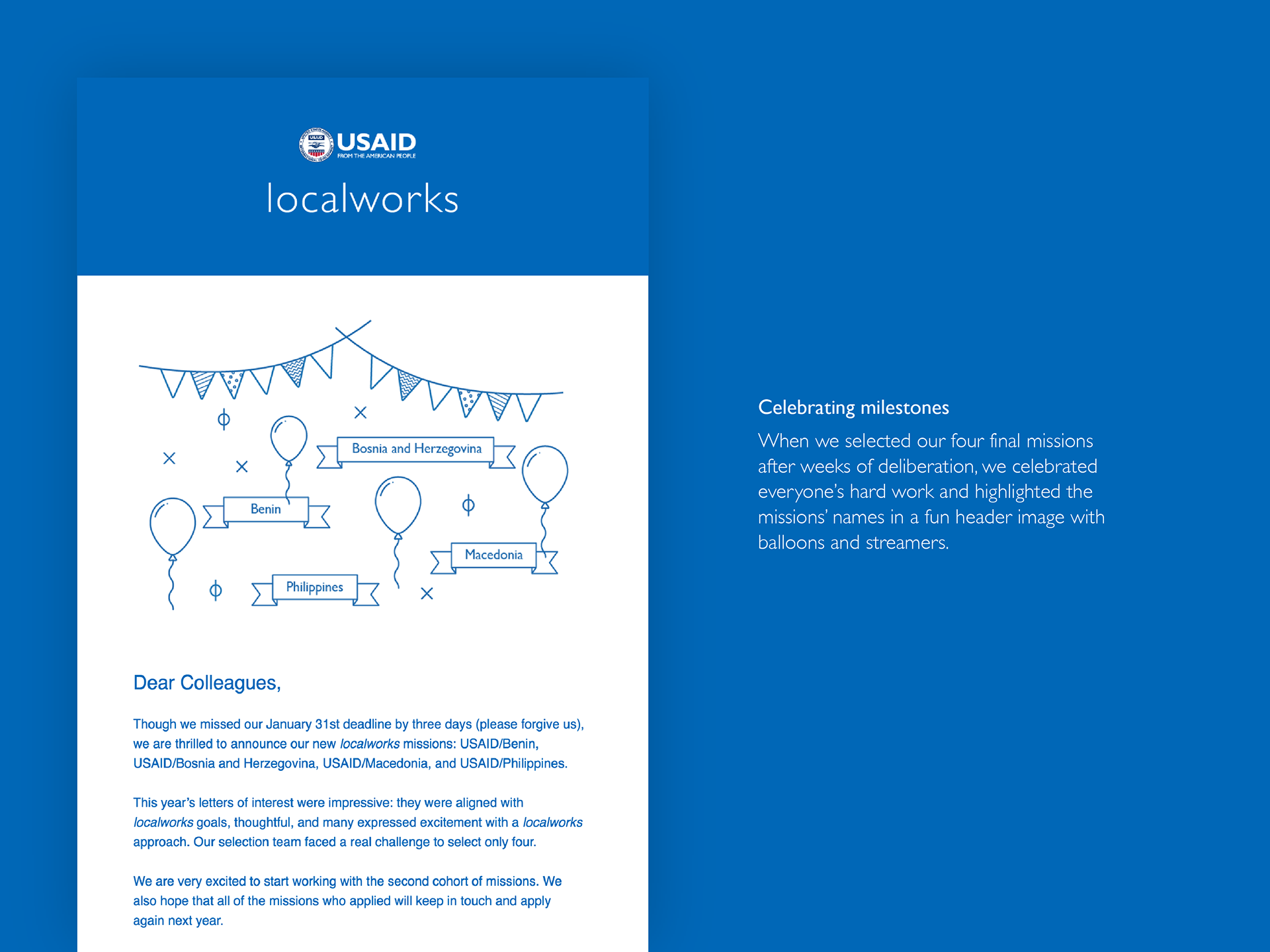
To break from the traditionally serious tone of USAID copy, I made sure our copy had personality, using humor and other human emotions when appropriate. For example, during the launch of our annual solicitation, USAID missions took part in a long application process to become a localworks mission. The process required an initial letter of interest, and was followed by various interview rounds until the final three missions were selected to participate in the $45 million program. Staying true to voice and tone, we made sure all our communication with missions was considerate of users’ feelings throughout this arduous application process. Celebrating milestones, big or small, was important. When we launched, we made it a big deal. When missions submitted their letters of interest, we celebrated their hard work. When we were delayed in making final selections, we thanked them for their patience. When the final four missions were selected, we congratulated them. Below are some of the ways in which we communicated with missions through our internal newsletter:
To break from the traditionally serious tone of USAID copy, I made sure our copy had personality, using humor and other human emotions when appropriate. For example, during the launch of our annual solicitation, USAID missions took part in a long application process to become a localworks mission. The process required an initial letter of interest, and was followed by various interview rounds until the final three missions were selected to participate in the $45 million program. Staying true to voice and tone, we made sure all our communication with missions was considerate of users’ feelings throughout this arduous application process. Celebrating milestones, big or small, was important. When we launched, we made it a big deal. When missions submitted their letters of interest, we celebrated their hard work. When we were delayed in making final selections, we thanked them for their patience. When the final four missions were selected, we congratulated them. Below are some of the ways in which we communicated with missions through our internal newsletter:
Brand Communication Channels
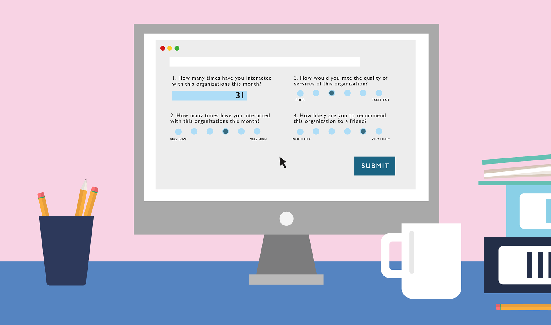
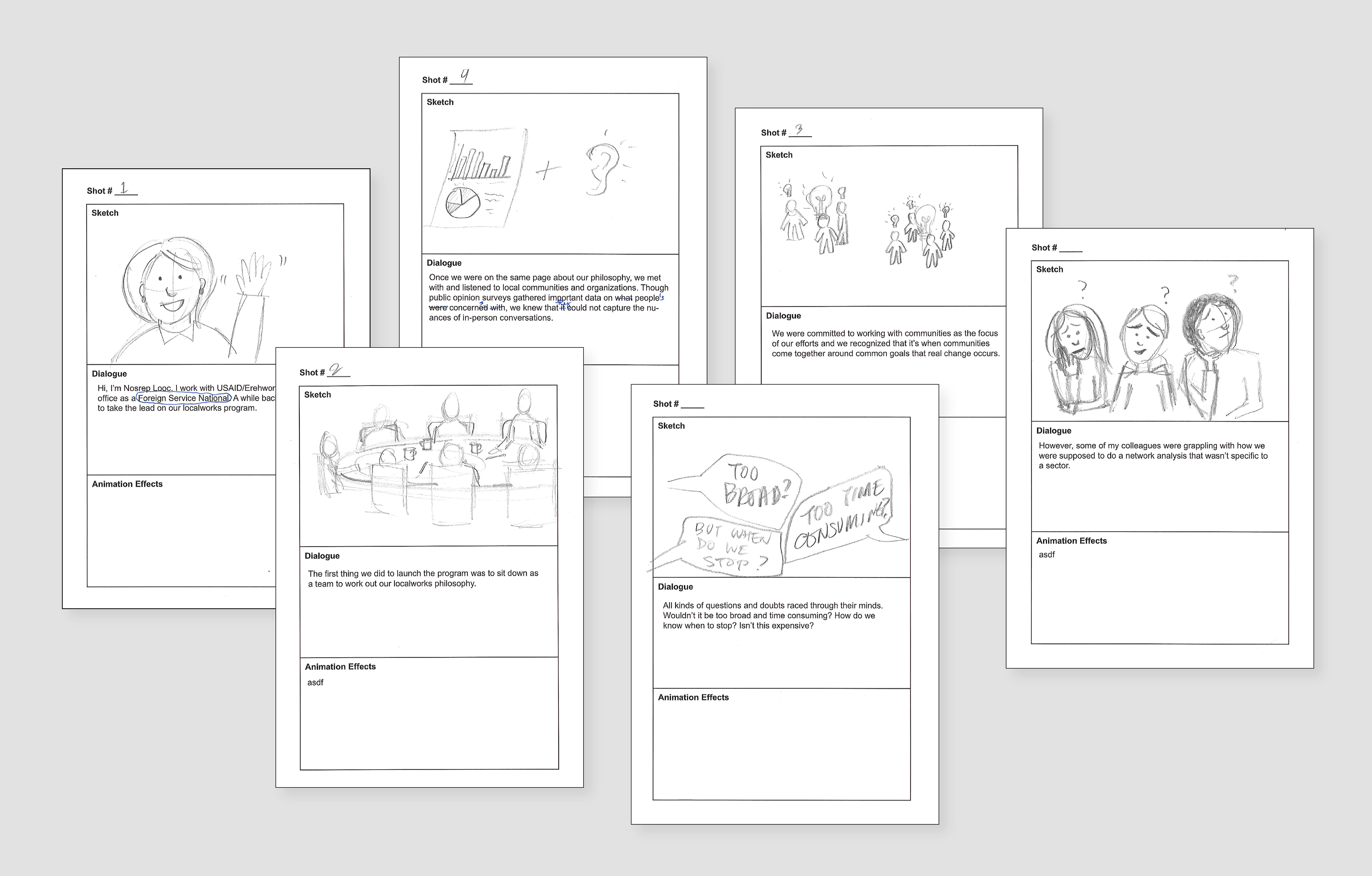
Besides one pagers, newsletters, slide decks, and written documents, I also used animation to communicate the localworks brand. As part of the localworks program, USAID missions are required to conduct a network analysis. The purpose of the analysis is to identify local resource organizations--organizations that are resource hubs that other local organizations trust and turn to for support and advice. Since there are strong local resource organizations across technical sectors--whether in health, education, or environment—it's important that the network analysis is not limited to any one sector. This animation video was created to explain the concept of a sector-neutral analysis to USAID missions. As our previous attempts to explain this idea was done through written documents and verbal presentations, we felt a visual narrative would be a more engaging medium. Below are some of the stills from the completed animation.
Storyboards
Character Design

Motionboards