The Need
Each year, localworks competitively selects three to four USAID missions* to carry out a localworks program in their respective countries. For the 2016 round, I took the lead for drafting the main program guidance—the primary introduction to the program’s principles, philosophy, and program structure for 60+ USAID missions globally.
*mission — aka USAID field offices located within the countries we serve. This can be confusing, especially if missions are on a mission.
*mission — aka USAID field offices located within the countries we serve. This can be confusing, especially if missions are on a mission.
The Context
USAID missions are busy. They manage multi-million dollar portfolios of dozens of programs in all kinds of sectors—democracy & governance, education, health, environment. They also have a lot to read—guidance documents for other programs, accompanying policy papers, thought pieces, etc. Many times, government documents are written without usability and readability in mind. They often follow a set of unspoken rules: the longer, the better; the more complex the sentences, the better; the more jargon, the better.
In terms of typesetting, government documents can often look too cluttered or "dark" in terms of typographic color. I kept this in mind for localworks and developed user-friendly layouts that focused on effective information delivery (how to get busy USAID missions to read and understand everything), as opposed to efficient information delivery (how do we squeeze as much information into one page). It was imperative that the localworks program guidance was easy to understand, friendly, and fun to read.
The Process
I wouldn’t have had a good case in joining the guidance drafting team if it wasn’t for the fact that I would be the one making sense of everything and formatting it in the end. Though it seems like superficial activity—tedious formatting and typesetting—it actually forces you to fully understand every piece of information and understand how they fit together and relate to one another. If there’s anyone who can recite the content back to someone from memory, it would be me.
While you format and physically move pieces of information around on the page, you realize there are flaws in some of the content. Your seemingly superficial treatment to the content actually directly influences the content itself. You question things. Why does this fall under this? Are these requirements or are they suggestions? Why don’t we group this info like this? This is exactly what happened when we were weeks into drafting the content of the document on Google Docs. We had typed out some 20 pages of information, but it wasn't coherent. I could tell it was written by several different people, and there were too many redundant sections. My colleagues and I were stuck.
This is when I tried out something different. I started laying out pieces of the content onto an InDesign publication spread. Now, this is something you wouldn't typically do when the content isn't fully ready. But as a visual thinker, I needed to see how the content could be organized on a publication format. In moving around the content onto spreads, I could see which parts should be put together, and overall, I got a better sense of the information hierarchy. It’s incredible to see how formatting can help you see the substance better and in turn help you influence it.
Challenges
A resistance to plain language
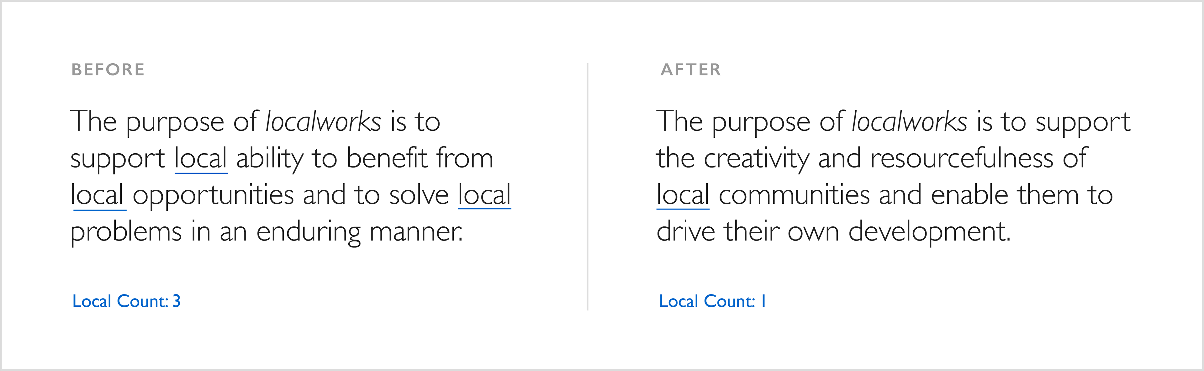
While plain language as an idea was accepted by my team, when seen in practice, there was some resistance to it. The skeptics worried that people wouldn't take us seriously. They equated plain language with “casual talk" that is too "fun" and "silly", and therefore not legitimate or trustworthy. Below is an example of the localworks purpose statement, which went through countless rounds of iteration before arriving at the final statement (right). Though it's not an official indicator, you can often tell how "plain" a sentence from our writing is by counting how many times you see the modifier "local".
While plain language as an idea was accepted by my team, when seen in practice, there was some resistance to it. The skeptics worried that people wouldn't take us seriously. They equated plain language with “casual talk" that is too "fun" and "silly", and therefore not legitimate or trustworthy. Below is an example of the localworks purpose statement, which went through countless rounds of iteration before arriving at the final statement (right). Though it's not an official indicator, you can often tell how "plain" a sentence from our writing is by counting how many times you see the modifier "local".
A resistance to being too direct
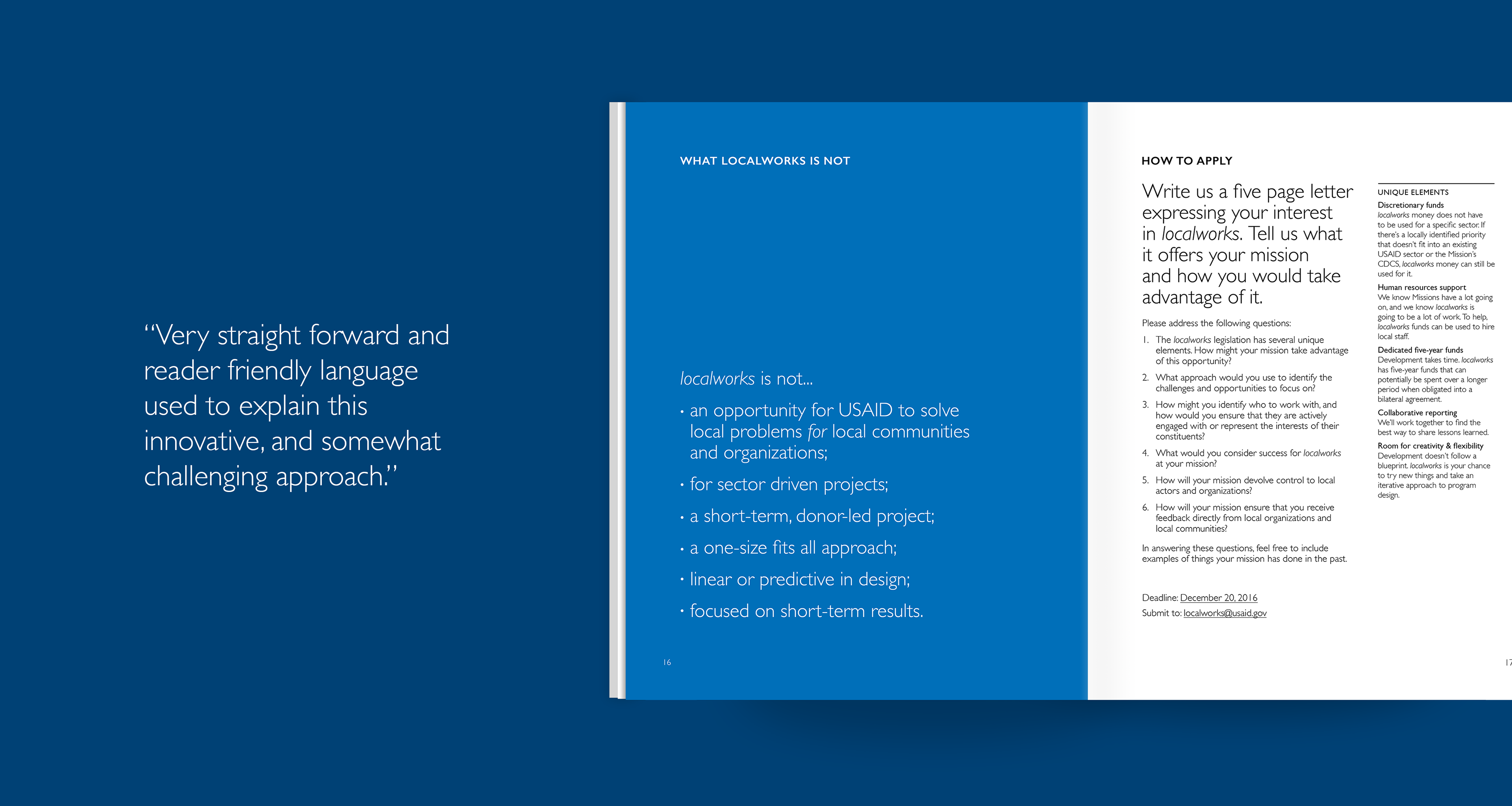
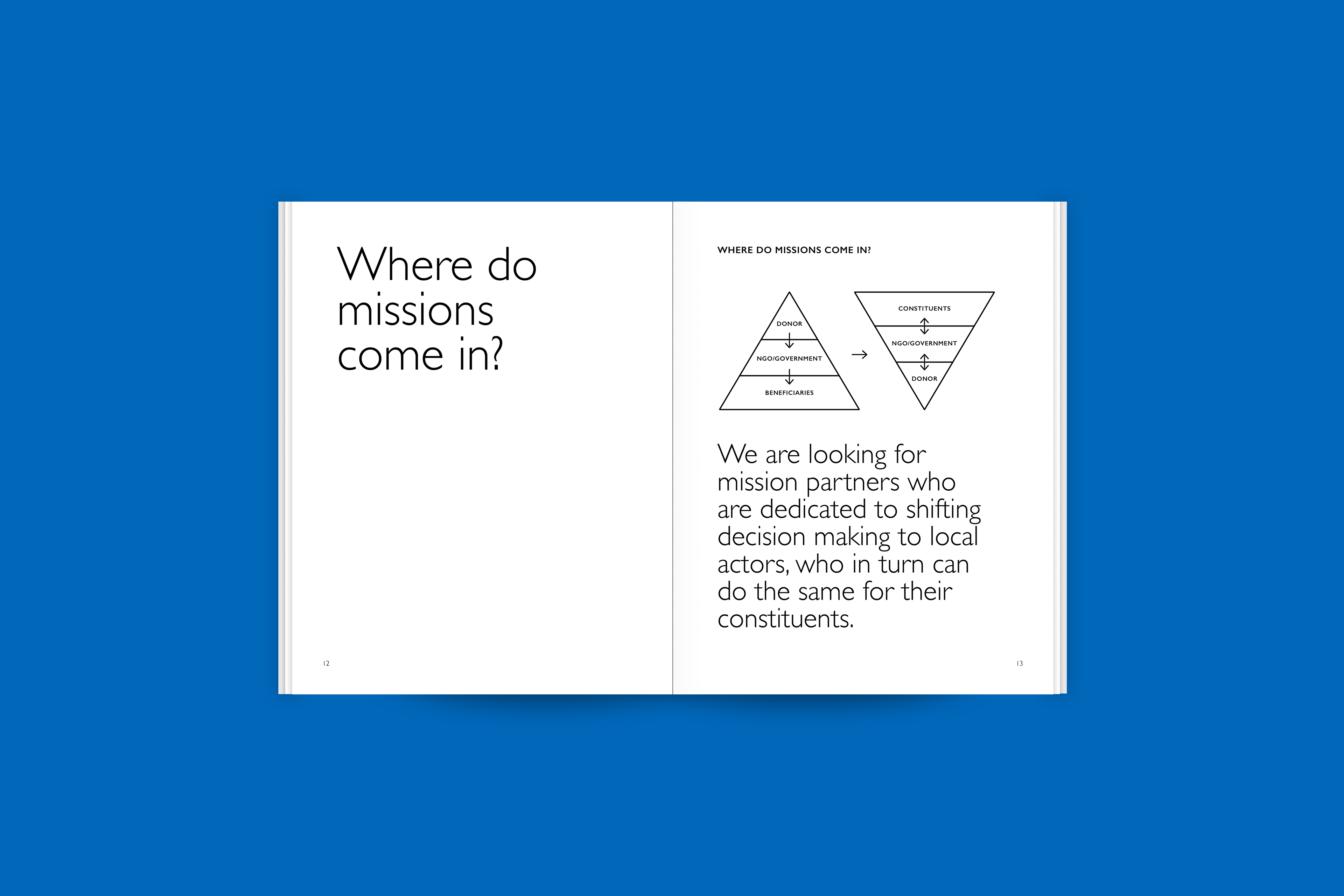
One of the main challenges of drafting the program guidance was balancing our tone. On one hand, we wanted to be respectful of all the work USAID missions had done and didn't want to push the localworks approach as if it was the only "right" way of doing development. On the other hand, we couldn't risk being vague about the program and the goals we were trying to achieve. We had risked this in 2015 when we first launched and was misunderstood as an opportunity for USAID to solve problems for local communities. I knew we had to be direct in our communication, and that there was a difference between being "directive" and "being direct". But of course, there was hesitation about this too. Below is an example of "being direct".
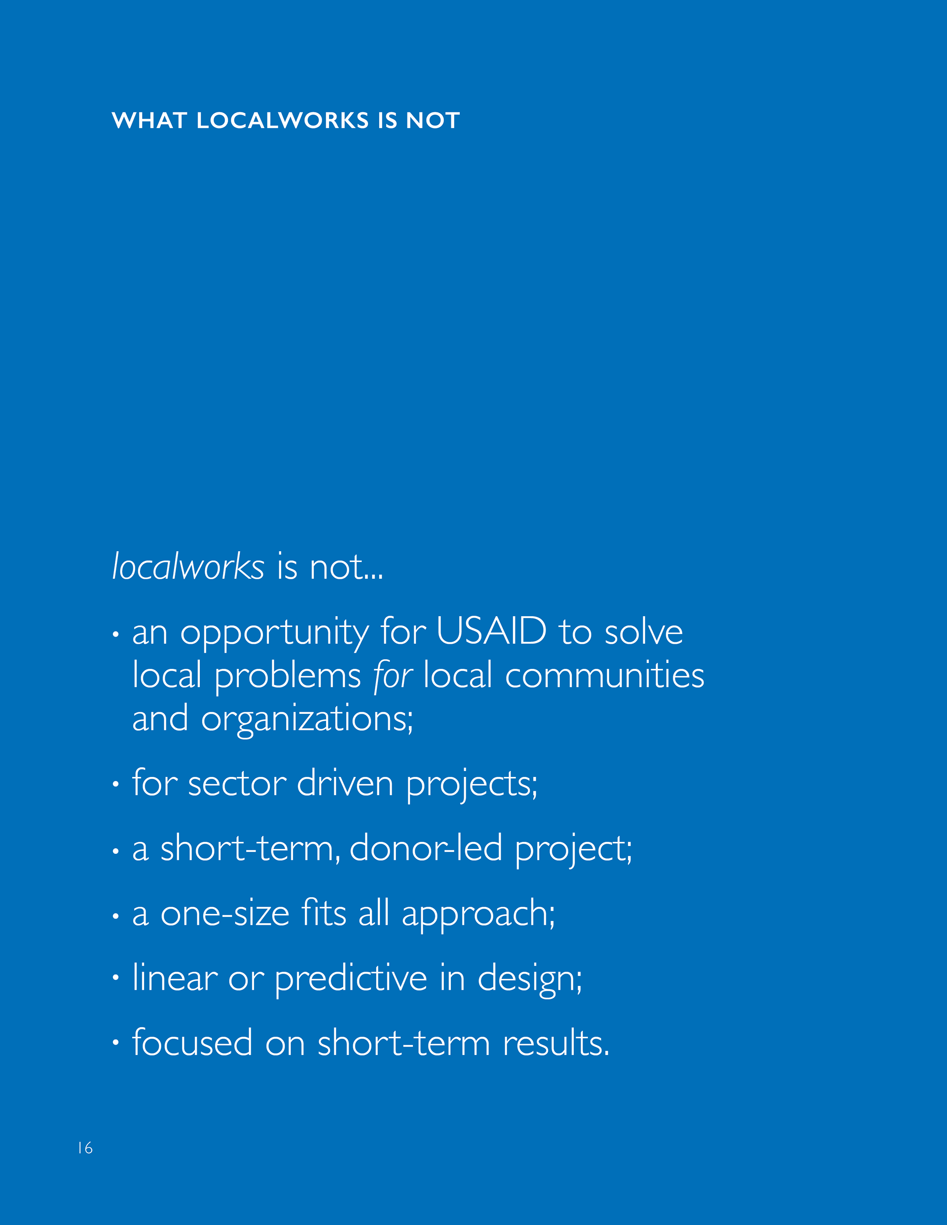
A full-color page outlining very clearly “what localworks is not” was included to ensure there was no misunderstanding about the program
A resistance to large type sizes and blank space
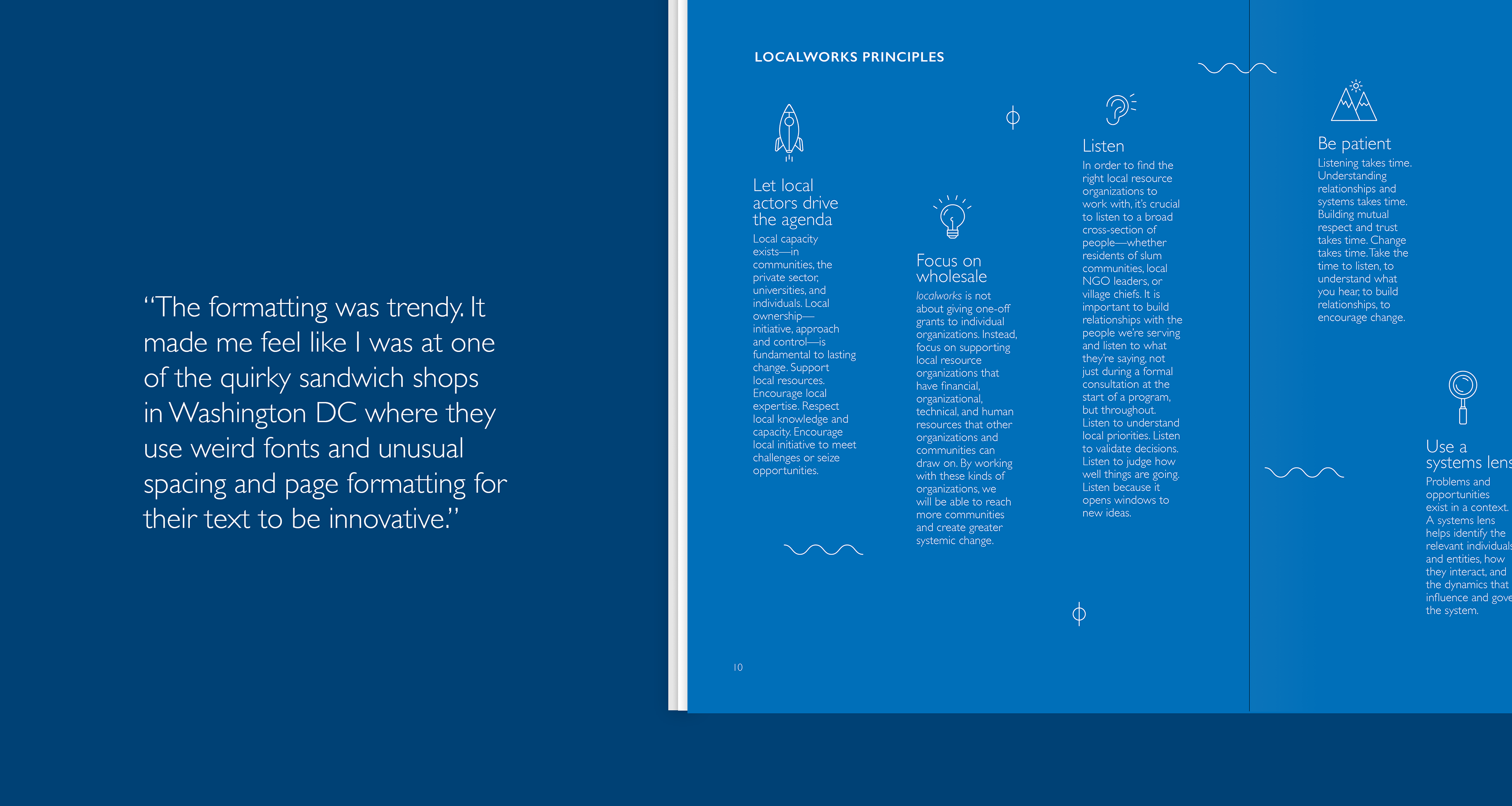
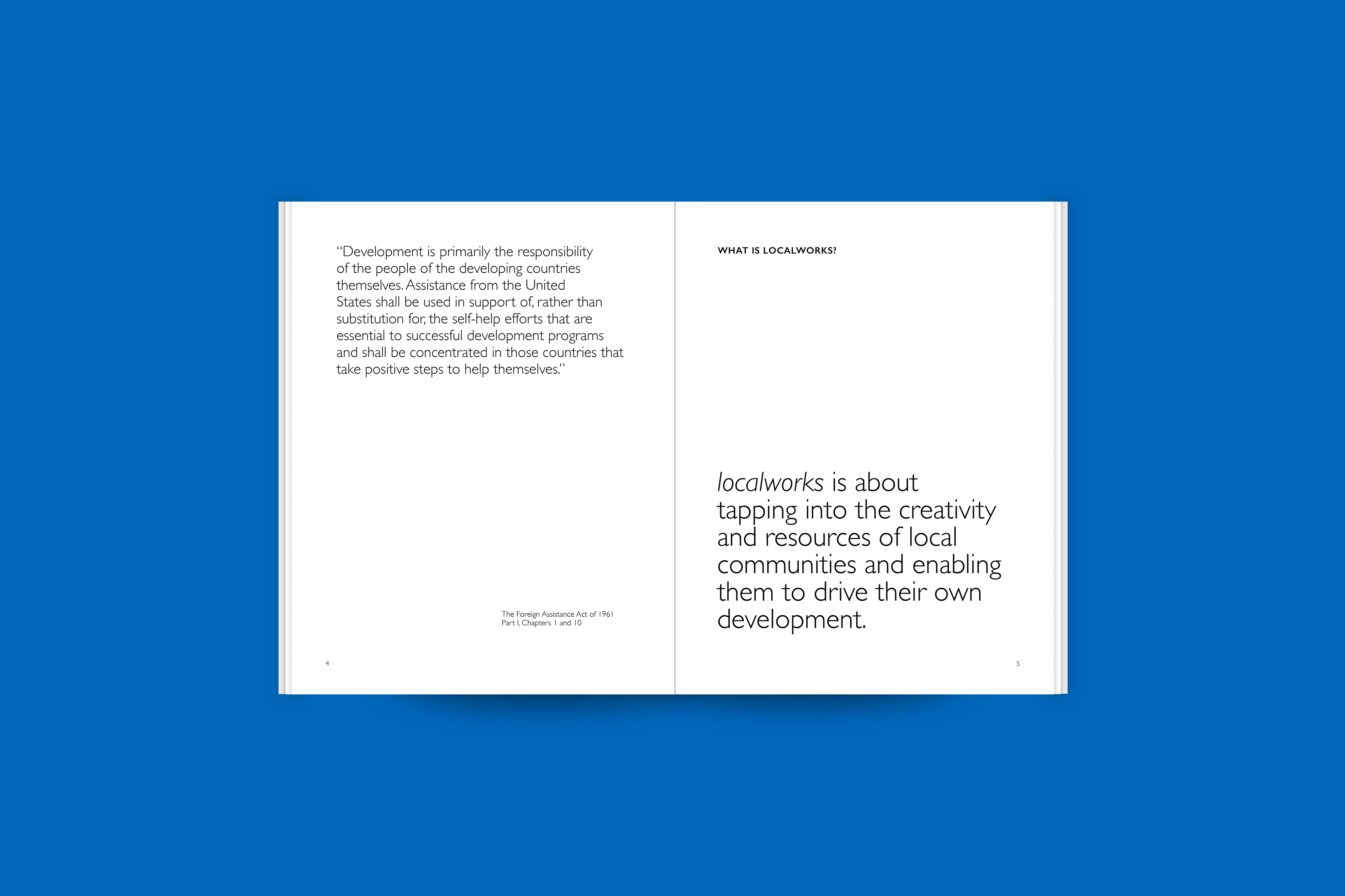
During a round of revisions, my supervisor asked me, “don’t you think this text is too big?” He was referring to one of the pages in the guidance that was mostly blank except for a single sentence in 45pt font, sitting at the bottom of the page. I came across similar comments throughout various rounds of revision. Some team members were practically shocked at how much blank space there were on some pages. I wasn’t trying to be minimalistic—I was simply trying to give missions no excuse to not read something. It was a visual break from the dark typographic color of some of the more wordy pages, and it was an intentional way of making a typically daunting document more friendly and accessible.
During a round of revisions, my supervisor asked me, “don’t you think this text is too big?” He was referring to one of the pages in the guidance that was mostly blank except for a single sentence in 45pt font, sitting at the bottom of the page. I came across similar comments throughout various rounds of revision. Some team members were practically shocked at how much blank space there were on some pages. I wasn’t trying to be minimalistic—I was simply trying to give missions no excuse to not read something. It was a visual break from the dark typographic color of some of the more wordy pages, and it was an intentional way of making a typically daunting document more friendly and accessible.
"O-M-G SO MUCH BLANK SPACE!!!!!"
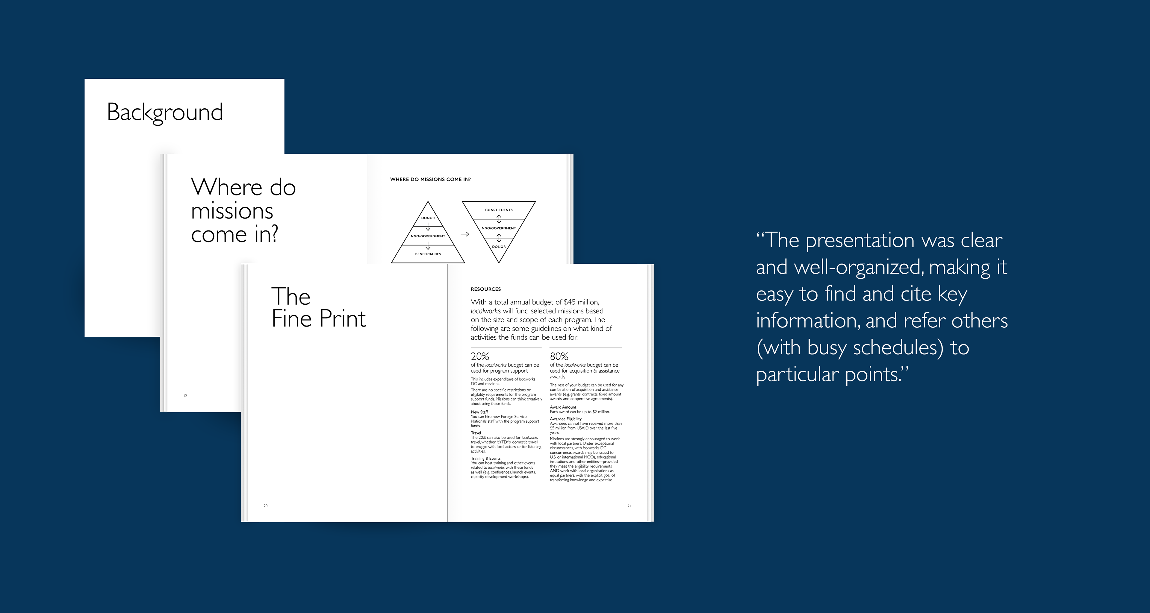
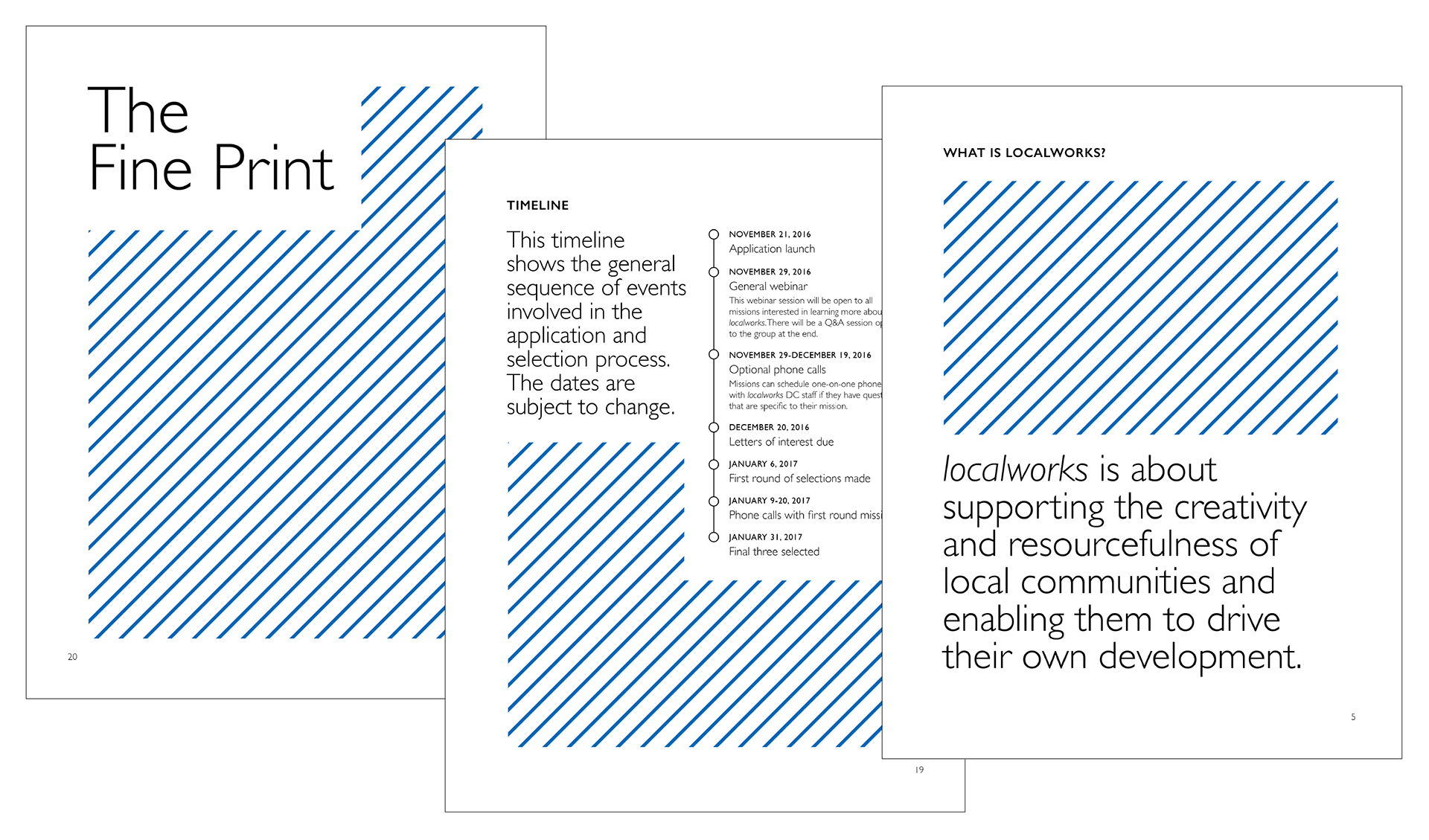
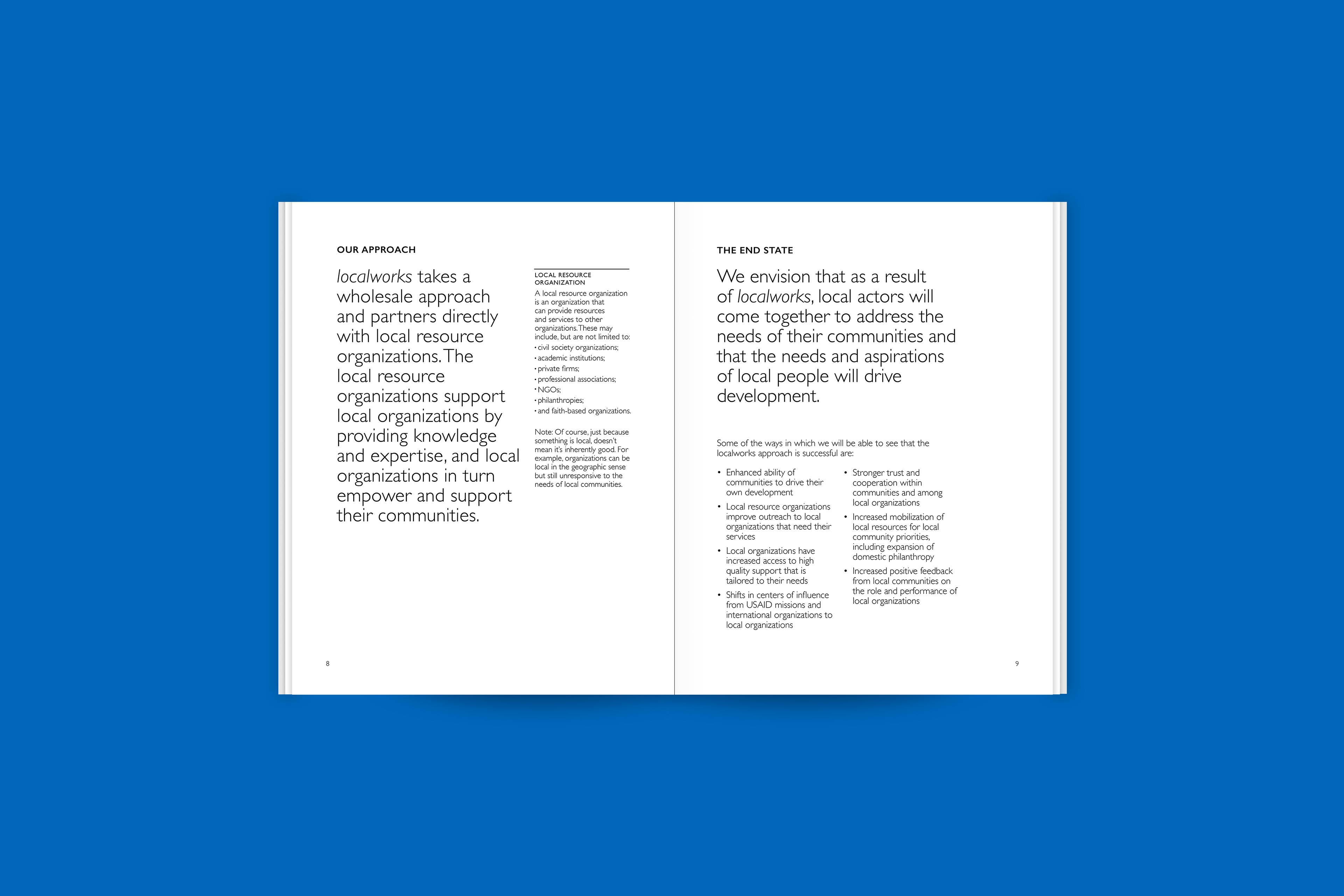
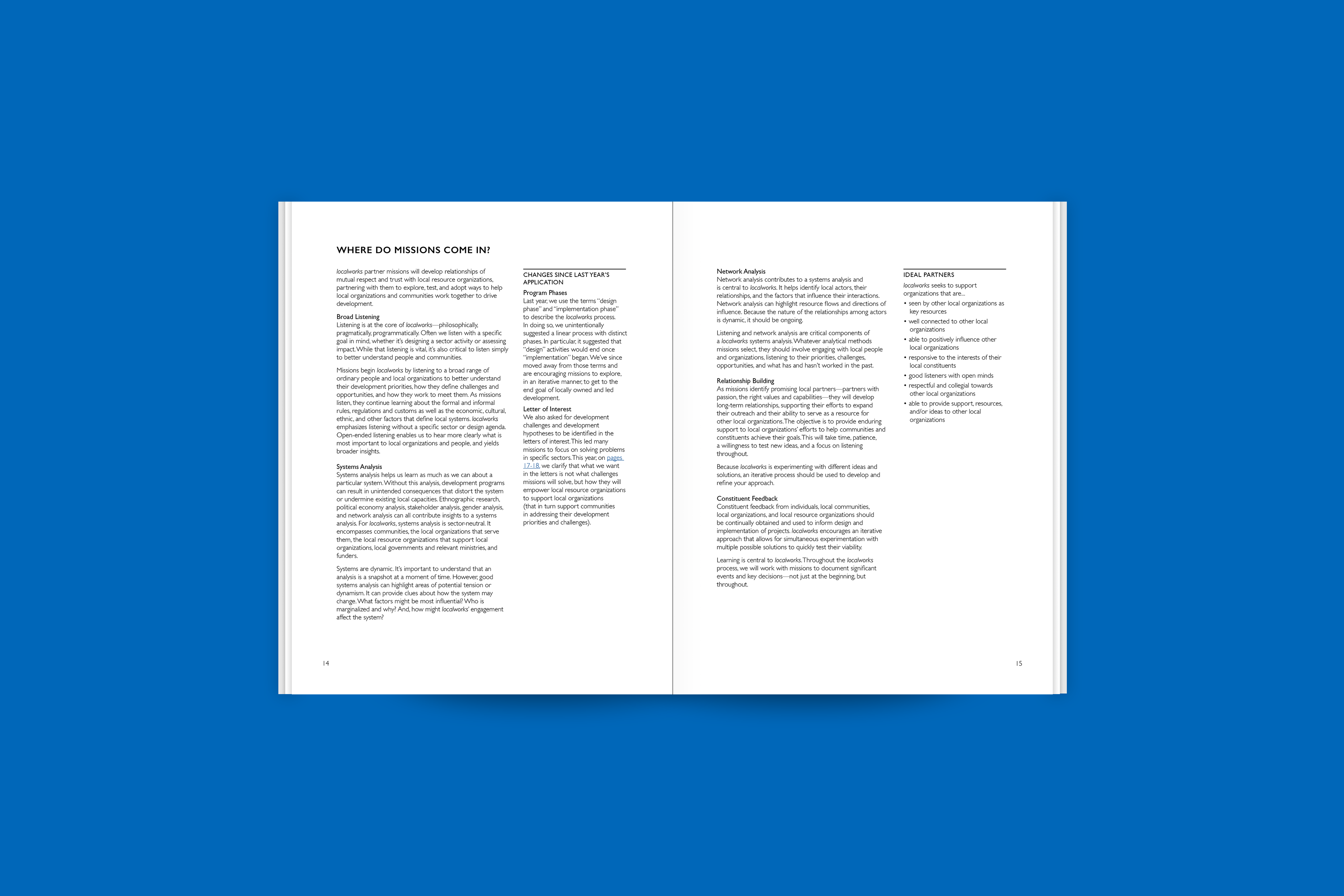
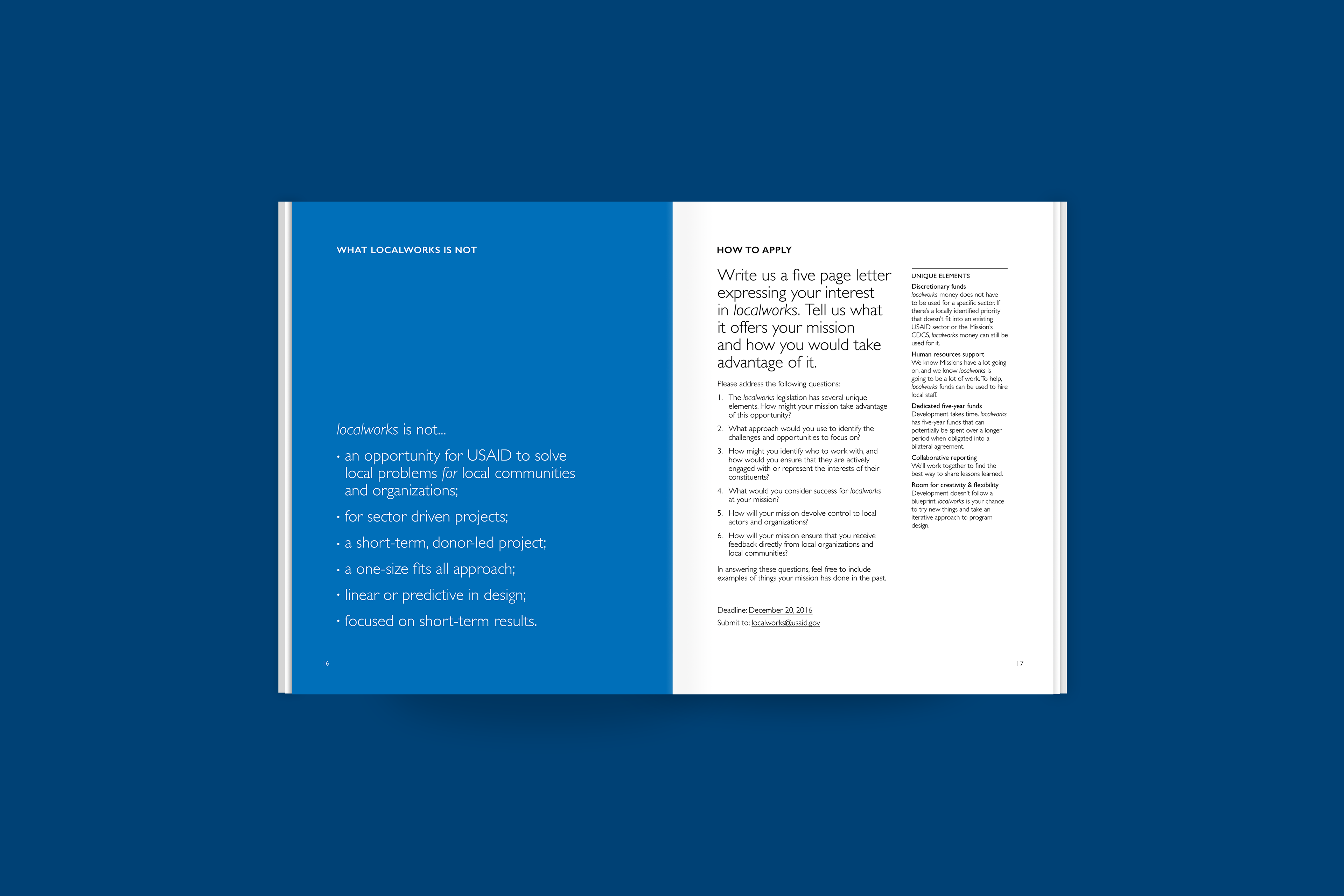
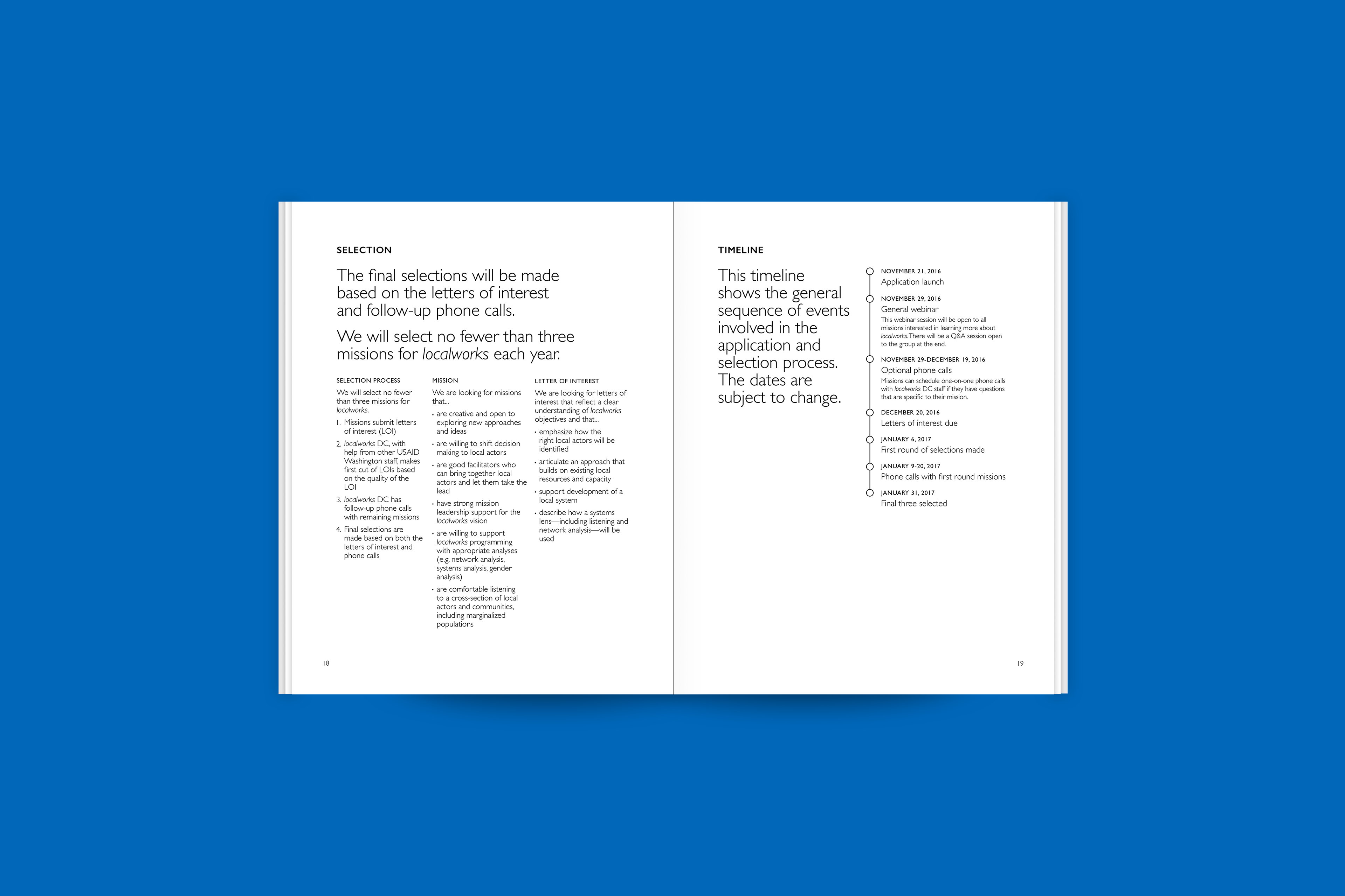
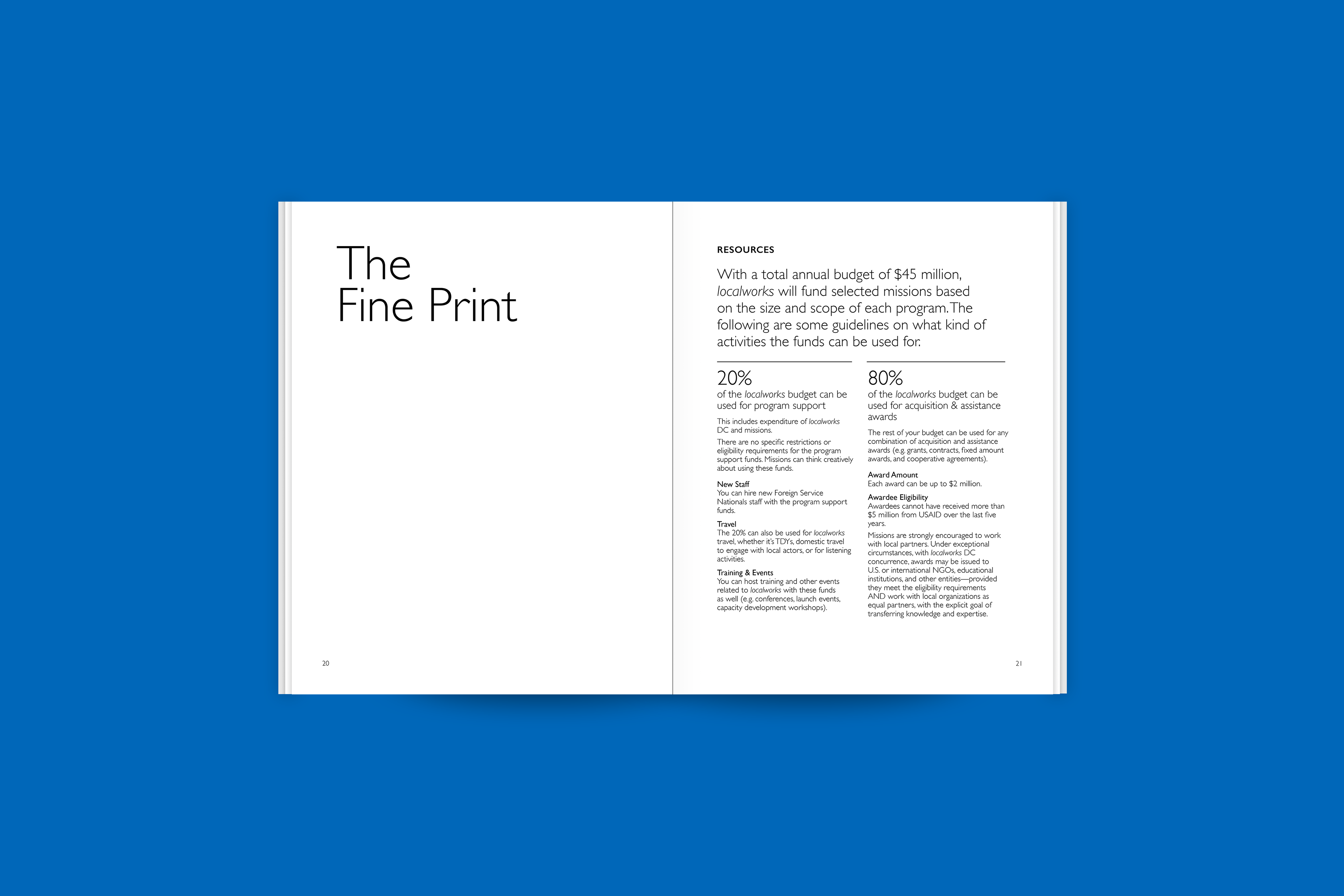
Below are just some of the spreads from the final 2016 program guidance:
The Results
Despite the many stumbling blocks along the way, we produced a program guidance that missions actually read, and had fun reading. Below are just some of the quotes from our post-launch survey by anonymous mission staff: